The Histogram - When to Use
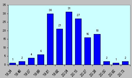
A histogram (or frequency plot) is commonly used to graphically view the distribution of your process data. This chart shows how often each value occurs.
The photo to the right shows data from a call center- specifically the time to answer an incoming call. The graph is very similar to a bar chart, but there are important differences.
The most important difference is that the histogram must have variable (or continuous) data to be used as an effective tool.

Remember that even if your data is numeric, it could be attribute data. If you collected data on the roll of a die, you have categorical data... all your data would fit nicely into one of six bins. You could chart the data using this tool, but the chart wouldn't provide much information to you.
Some Uses for Histograms
- Viewing the overall distribution of your data- primarily to determine if the data is considered to be a normal distribution.
- With the addition of specification limits, you can determine the ability of the process to meet requirements.
- Visually verify if current process data is similar to previous days, weeks, months, etc.
- Verification that two or more similar processes have the same data distribution
- To easily show others how the process is performing
All expensive statistical software has the capability to create very nice frequency plots. Even many of the Excel (a trademark of Microsoft Corporation) add-ins have this ability. One of the best software solutions in the Six Sigma world costs $1200. I own it and it is indeed outstanding software! I use it regularly. The better add-ins are around $200 (I own it, too). Not as easy to use as the high-dollar program, just as effective... yet, still too expensive for what most people need.
Even in my own improvement projects, I only use about 60% of the capability of the expensive software. Most companies only need the Seven Quality Tools to solve nearly all their issues and complete their improvement projects. So Carpenter Group has developed Excel spreadsheets that are not only cost effective, but are easy to use, too. The graph at the top of the page is from our spreadsheet.

The data entry area is shown in the screenshot above. Up to 200 individual data points can be entered into this area. The spreadsheet counts how many entries you have, determines the appropriate number of bins for your data, and creates the histogram.

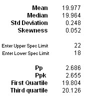
All of the important statistics are also calculated for you... Mean, Median, Standard Deviation, First and Third Quartiles. All that plus the ability to calculate Process Performance Indices like Pp and Ppk.
Excel doesn't come with the ability to create a histogram from the menu bar. So we figured out how to make it easy for you, and at as low of a price as possible.
Offered at a price of $4.95, our Histogram Excel spreadsheet is an outstanding value! It's impossible to improve a process without knowing exactly how the process has been operating, or if the process output has changed. This may be the most important of the Seven Quality Tools!


Advance one step further with our Root Cause Analysis Seminar.
Looking for a simple and effective project management spreadsheet? Buy our Gantt Chart for only $3.95


